

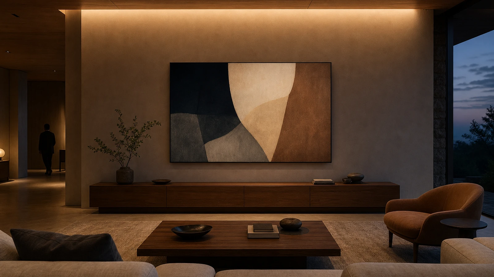
Digital art feels at home when the screen is treated as one considered object in the room, not as a miniature exhibition system that must perform all day. Choose a location that already makes sense for art, decide when the display should be active, limit the visual palette, and give the wall enough quiet space around it. The goal is to let changing images add atmosphere while the furniture, materials, daylight, and people still define the home.
Begin with the room rather than the device. A screen can behave like framed art, a low-key moving image, a personal photo surface, or an occasional focal point. Those are different jobs. Decide which one you want before comparing sizes, finishes, subscriptions, or mounting methods. A clear role prevents the display from becoming a bright rectangle that is technically impressive but visually restless.
Choose the role before the hardware
Write a sentence that begins, “This display is here to…” You might finish with “show a slowly changing group of abstract works during dinner,” “rotate family photography on weekends,” or “play one subtle motion piece for guests.” If the sentence becomes a list of every possible feature, narrow it. Rooms feel more coherent when objects have understandable jobs.
Also decide what the display is not. It may not be a television, a household dashboard, a notification center, or a permanent source of colored light. Separating those roles reduces interface clutter and makes the art easier to experience. If one device must serve several purposes, create distinct modes and make the art mode visually clean.
Pick a wall that can tolerate change
A digital display naturally attracts attention because it emits light and can change. Place it where that attention is welcome. A living-room wall, dining-room sideboard, wide hallway landing, or quiet reading corner may work. A narrow passage where people brush past, a wall exposed to strong reflections, or a bedroom sightline that you want to feel dark may be less successful.
Look at the wall from every normal approach, not only from the best seat. Check whether the display competes with a fireplace, a television, a dramatic window, or a collection of small objects. Two focal points can coexist, but they need a hierarchy. If both are bright, animated, or centered, the room can feel like several displays arguing for attention.
Use painter’s tape or a paper rectangle to test the proposed size. Leave it in place for a day. Sit, stand, enter the room, and view it after dark. The test reveals scale and height without requiring a purchase or a hole in the wall.
Size the composition, not just the screen
Judge the full wall grouping: display, console, lamp, chair, shelving, and empty space. A modest screen can feel substantial when centered over a narrow cabinet. The same screen may look lost on a large blank wall. Conversely, an oversized display may read as a television even when it shows art.
Height should follow the way the room is used. Art viewed while seated may sit lower than a piece in a standing hallway. Avoid placing it so high that everyone looks upward or so low that furniture blocks it. If it hangs above a console, leave breathing room rather than squeezing it between the furniture and ceiling. The relationship should look intentional when the display is off.
Make the dark rectangle part of the design
Every digital-art plan must account for the inactive state. Some screens appear nearly black, some show reflections, and some can present a low-power image depending on their design. Imagine the room during a power outage or scheduled off period. Does the frame still look balanced? Does the black surface dominate a pale wall? Would a darker wall, a larger mat-like surround, or a nearby material element help it settle in?
A frame finish should relate to something already present, such as wood furniture, dark window trim, or a quiet metal detail. Exact matching is unnecessary. Repeating a material once or twice is usually enough. Avoid adding several decorative objects merely to disguise the technology; that can produce more visual noise than the display itself.
Edit the art like a small collection
A home rarely benefits from an endless feed. Start with a group that shares one or two traits: subdued color, high-contrast monochrome, geometric form, landscape photography, or a similar emotional tone. The works need not match, but abrupt shifts from a quiet drawing to a saturated animation can make the room feel unstable.
Use fewer pieces and let each remain long enough to be seen. Rapid rotation turns art into a slideshow and can make movement in peripheral vision tiring. A still image for an evening, a weekly selection, or one motion work played intentionally often feels more deliberate than a new image every few minutes.
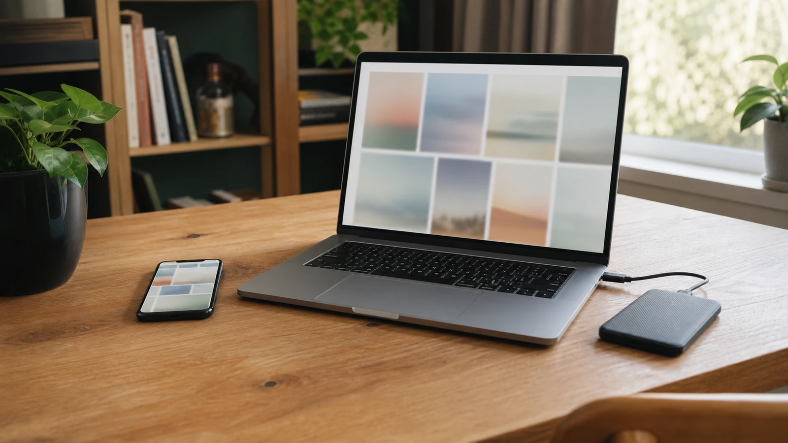
Personal photography can work beautifully when it is edited with the same restraint. Choose images for composition and room fit, not only sentiment. Prepare crops on copies rather than altering originals, and keep the source library orderly. Disco Lift’s guide to organizing digital photos across a phone and computer can help separate the master library from display-ready versions.
Balance emitted light with the room
A display should not look like a window onto a brighter building. Set its brightness for the actual room and revisit it as daylight changes. An automatic setting may help, but observe whether it produces a comfortable result rather than assuming that a sensor understands the mood you want. At night, lower output and a nearby shaded lamp can keep the wall from becoming the only luminous surface.
Reflections are often more distracting than insufficient brightness. Before mounting, hold a dark tablet, glass frame, or other reflective surface at the proposed location. Look for windows, lamps, and ceiling fixtures in it. Adjust the angle or location, add controllable window covering, or move the competing light. Increasing screen output to overpower a reflection may make the room harsher without solving the underlying problem.
Motion requires even more restraint. Slow changes can be atmospheric, but flicker, fast cuts, and high contrast may be uncomfortable or distracting for some people. Give household members an easy way to pause the work or turn the display off. Art in a shared home should not require everyone to tolerate a continuous effect.
| Design decision | Residential approach | Showroom warning sign | Low-risk test |
|---|---|---|---|
| Placement | One wall with a clear viewing reason | Screen added to every available zone | Paper template viewed from normal paths |
| Collection | Small edited group with a shared tone | Endless feed and constant novelty | Trial playlist of a few works for one week |
| Brightness | Balanced with daylight and nearby lamps | Display is the brightest object at night | Compare active and off states after sunset |
| Motion | Occasional, slow, and easy to pause | Continuous animation in peripheral vision | Live with one motion piece before adding more |
| Controls | Simple schedule and accessible off control | App, account, or subscription required for every action | Test ordinary use without the primary phone |
Hide infrastructure without hiding access
Plan power and connectivity before mounting. A clean installation should not depend on a cord pulled tight, routed through a door, pinched behind furniture, or placed where it can be tripped over. Use the mounting and cable methods permitted for the wall, device, and local electrical situation. Permanent electrical changes belong with a qualified professional.
Do not bury every component so thoroughly that resets, ventilation, ports, or removal become difficult. Leave service access and follow the device’s spacing guidance. Photograph the cable route before closing any removable cover. If the display relies on wireless connectivity, confirm performance at the final wall rather than only near the router.
Design the off schedule
An off schedule is part of the composition. Decide when the screen should wake, dim, pause motion, and shut down. It might remain off during work hours, activate for a few evening hours, and stay dark overnight. A schedule can reduce visual fatigue and make the art feel like an event rather than an appliance that is never allowed to rest.
Keep a physical or plainly accessible off control. Visitors, children, house sitters, and other household members should not need the owner’s personal phone to quiet the display. If connected controls are part of the setup, start small, preserve fallback behavior, and confirm that ordinary operation still works when an app or network is unavailable.
Consider accounts, privacy, and ownership
A connected frame or art display may use accounts, cloud libraries, mobile apps, cameras, microphones, location permissions, or shared access, depending on the product. Review the exact device and service before purchase. Disable features you do not intend to use, limit who can upload or change settings, and understand what happens to the collection if a subscription ends or a service changes.
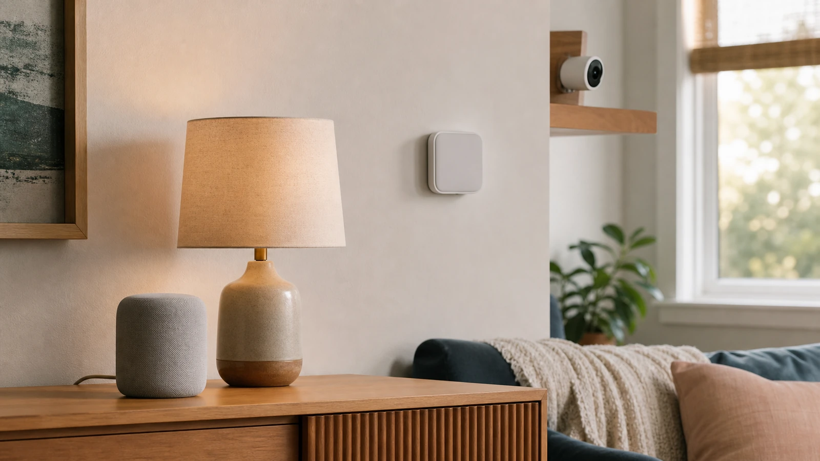
Do not upload private family images merely because the display makes sharing easy. Decide which photographs may leave the household library, who can invite contributors, and how access will be removed. For a broader room-by-room way to evaluate permissions and data flows, use the beginner’s guide to smart-home privacy settings.
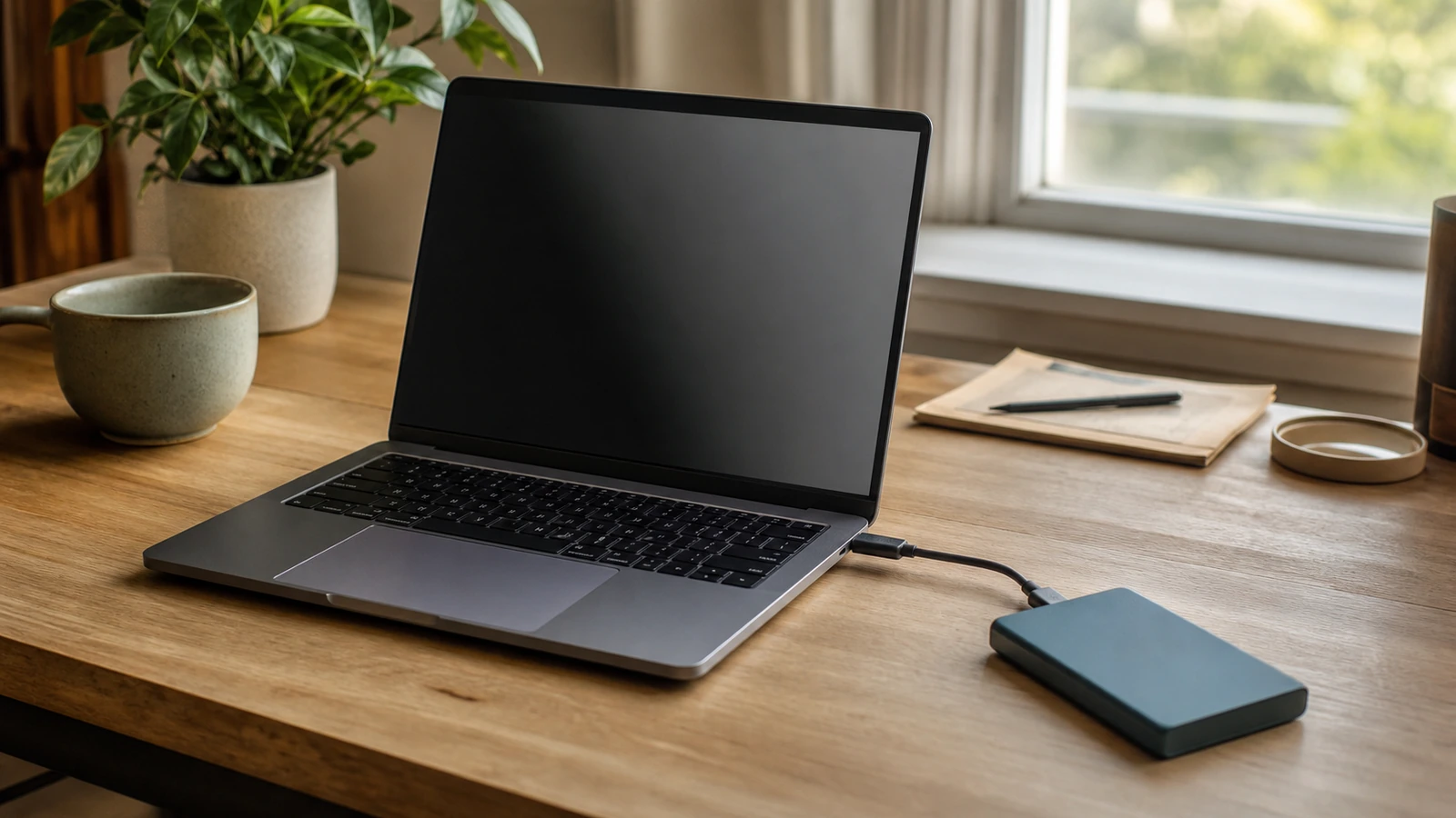
Keep independent copies of art you own or are permitted to store. A display library is not automatically a durable archive, and a synced deletion may propagate. The guide to cloud storage versus external drives explains how different storage layers can fail and why restore testing matters. Respect the artist’s license and the terms governing display, downloads, sharing, and commercial use; buying access to a platform does not necessarily transfer ownership of every file.
Avoid the most common showroom effects
Too many synchronized screens
Repeating the same image across several rooms can feel commercial and removes the pleasure of discovery. Begin with one display. If another is later added, give it a separate purpose and collection rather than treating the home as a coordinated sales floor.
Constant color matching
Changing every lamp to match each artwork may turn the room into a demonstration. Let furniture and ordinary lighting remain stable. If a work needs complementary light, use one restrained nearby source rather than recoloring the entire space.
Interface residue
Visible menus, status messages, loading indicators, clocks, and notifications weaken the illusion of art. Configure a clean display mode and test what appears after lost internet, a restart, or an expired login. If the device cannot recover gracefully, decide whether that friction is acceptable before mounting it prominently.
Art chosen only to impress visitors
A home collection should still feel worthwhile on an ordinary Tuesday. Include work you enjoy living with, not only pieces that demonstrate resolution, motion, rarity, or technical novelty. Quiet art can make a stronger long-term companion than a spectacular loop.
Run a one-week room test
Load only a few works and use the proposed schedule for a week. Observe the display during daylight, dinner, conversation, television viewing, reading, and late evening. Ask whether it interrupts attention, reflects a lamp, brightens the room too much, or feels empty when off. Invite every regular household member to name one thing they would change.
At the end of the week, adjust one variable at a time: location, height, brightness, duration, collection, or nearby lighting. Do not solve a curation problem by buying a larger screen, and do not solve glare by adding more brightness. The trial is successful when it reveals the smallest change that makes the display easier to live with.
FAQ
Can a regular television display digital art?
It can, if its art or photo mode provides an acceptable image, clean interface, brightness range, schedule, and inactive appearance. Consider energy use, reflections, startup behavior, and whether the screen still reads primarily as a television in the room.
Should digital art match the room’s color palette?
It does not need to match exactly. A collection can repeat one room color, introduce a controlled contrast, or remain neutral. Consistency across the playlist matters more than making every image copy the upholstery.
How often should the artwork change?
Change it slowly enough that each piece can be noticed without creating constant peripheral motion. That may mean one work per evening, a weekly rotation, or manual selection. There is no universal interval.
Is motion art a good choice for a bedroom?
Only if the movement and light feel comfortable to the people using the room and the display has a dependable dark schedule. Many bedrooms benefit from keeping animated work outside the direct sightline from the bed or reserving it for earlier hours.
Takeaway: curate the wall, not the technology
Give the display one purpose, one well-tested location, a restrained collection, balanced brightness, and a clear off state. Plan cables and access before mounting, protect accounts and original files, and let the room remain visually quiet around it. Digital art feels most personal when it behaves like a thoughtful part of daily life—not a feature that is always asking to be demonstrated.

Madison Rowe
Madison Rowe is a Disco Lift staff byline covering everyday technology, digital organization, privacy, and connected devices. Articles published under this pen name are reviewed under Disco Lift’s editorial standards.